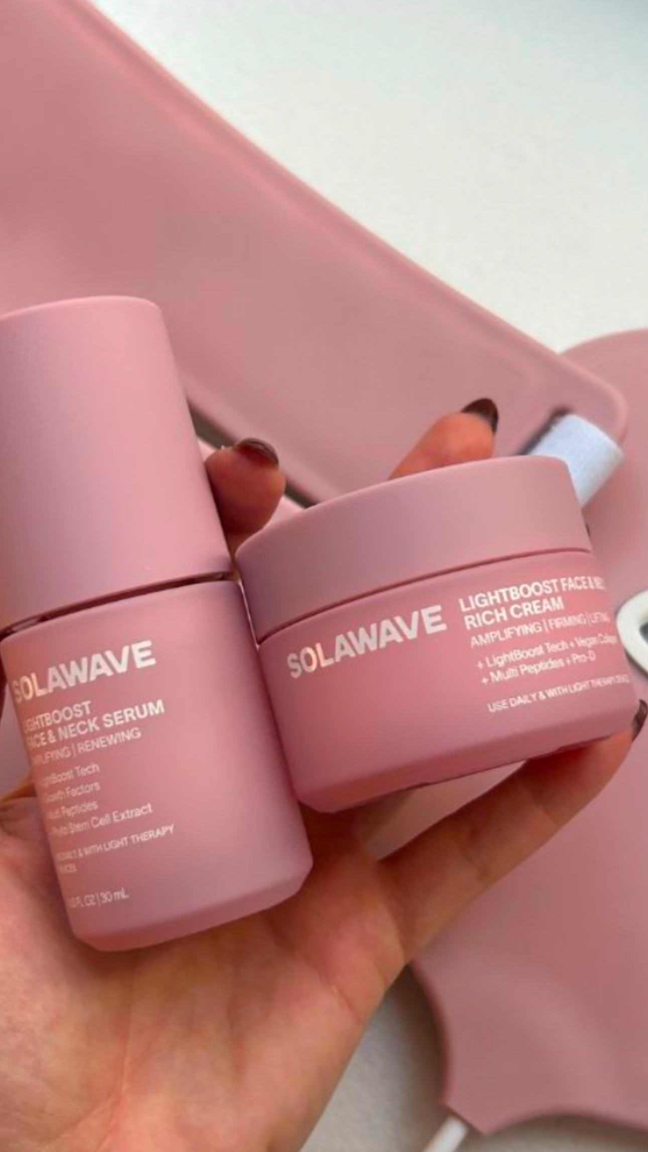
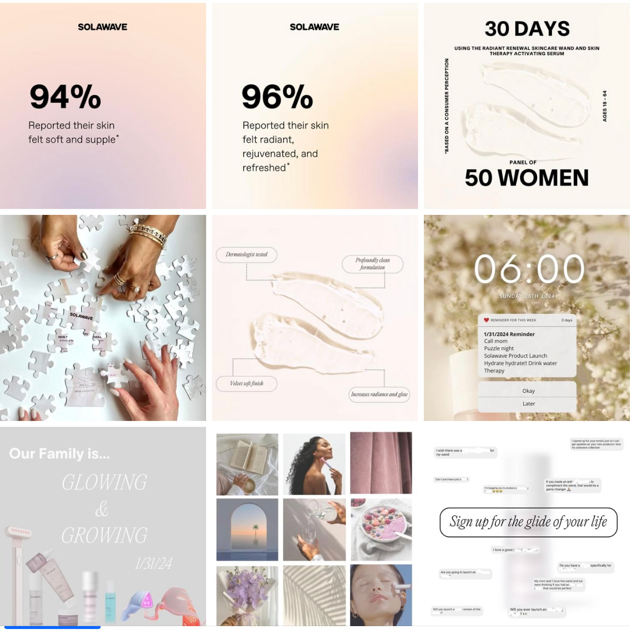
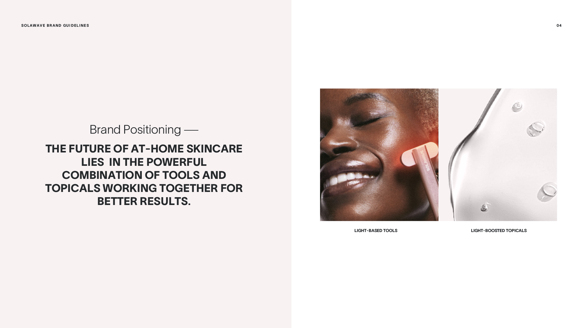
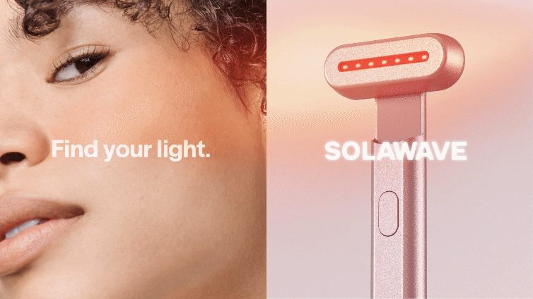
Startups often face the challenge of defining a clear, cohesive brand identity that resonates with their audience. In this case, the initial brand guidelines were overly complex, featuring an intricate typographical structure and an excessive use of primary, secondary, and gradient color palettes. This led to frequent misinterpretation of brand assets and ultimately diminished the overall impact, making the brand appear inconsistent and less professional. Our brand identity solution streamlined the design by simplifying the typography and refining the color scheme, resulting in a more cohesive, recognizable brand that communicates clarity and strength.
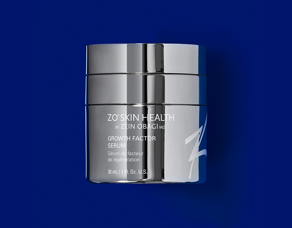
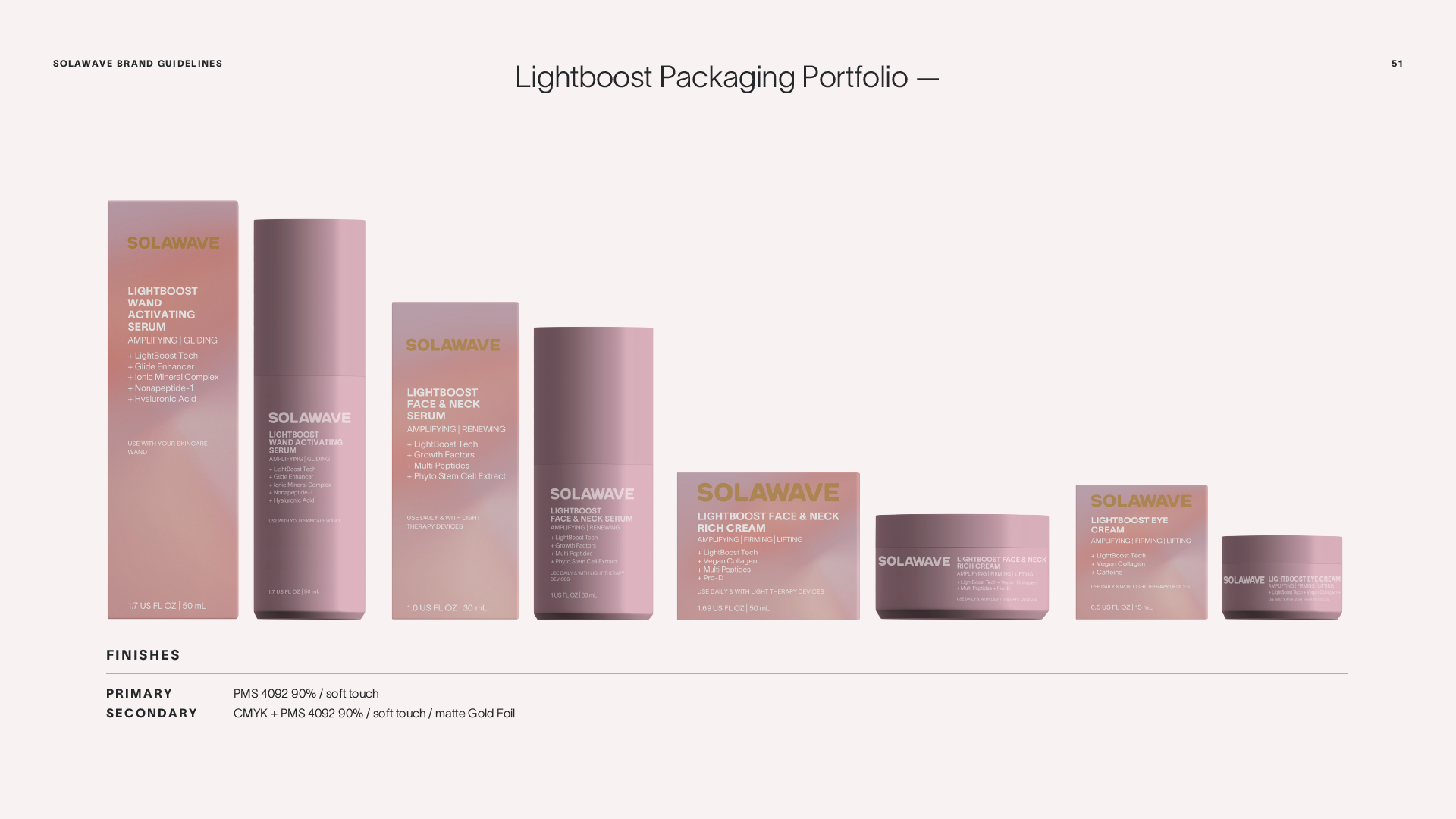
In addition to improving the visual brand identity, we also developed a new packaging solution that not only aligns with the refined brand but stands out from competitors, offering a distinct and memorable presence in the marketplace.

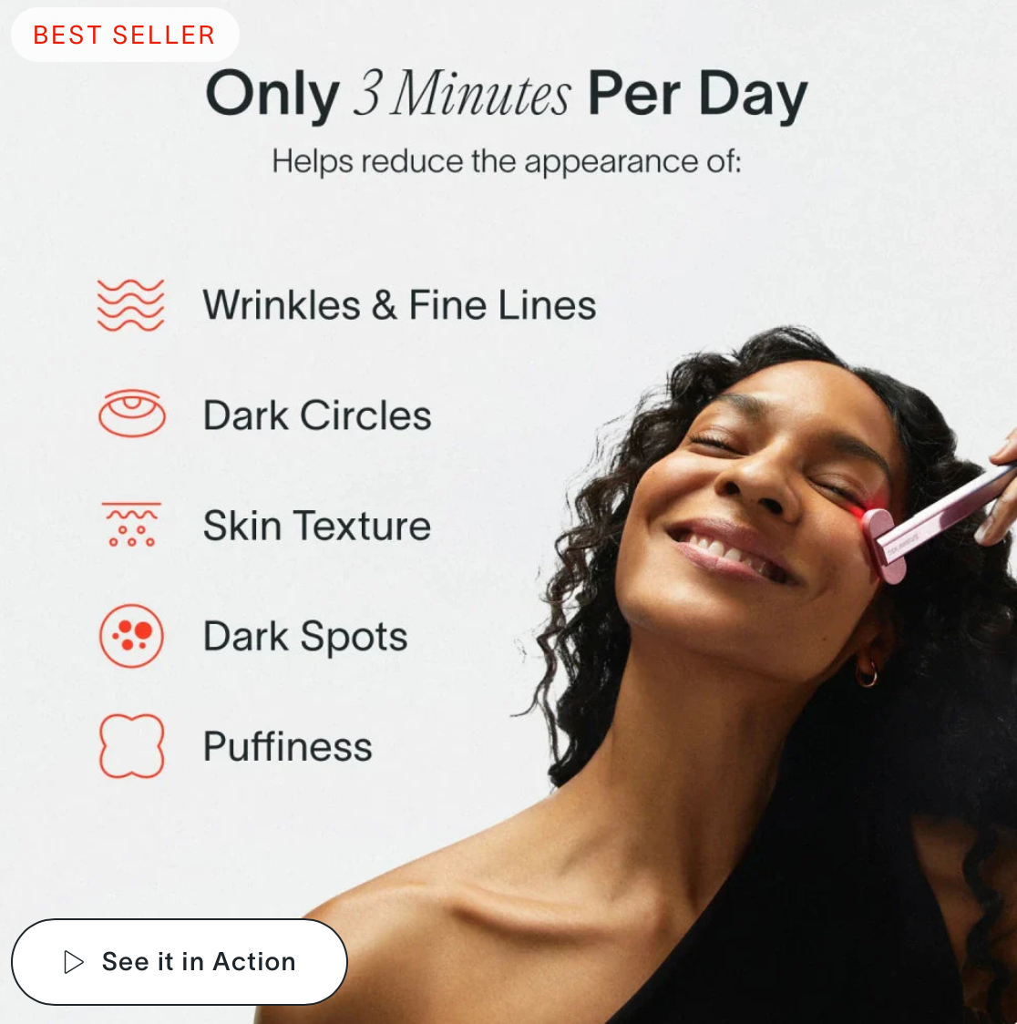

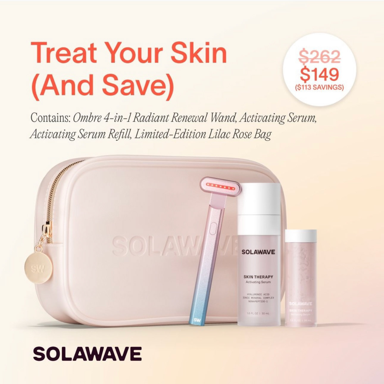

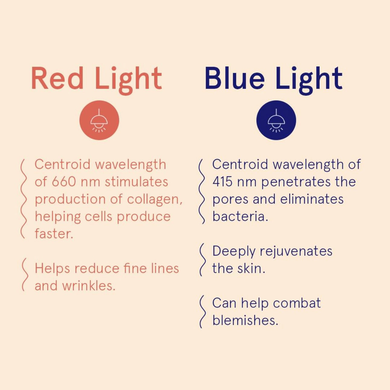
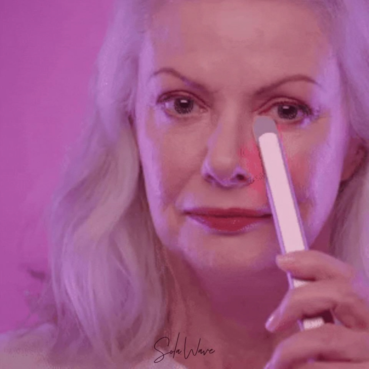


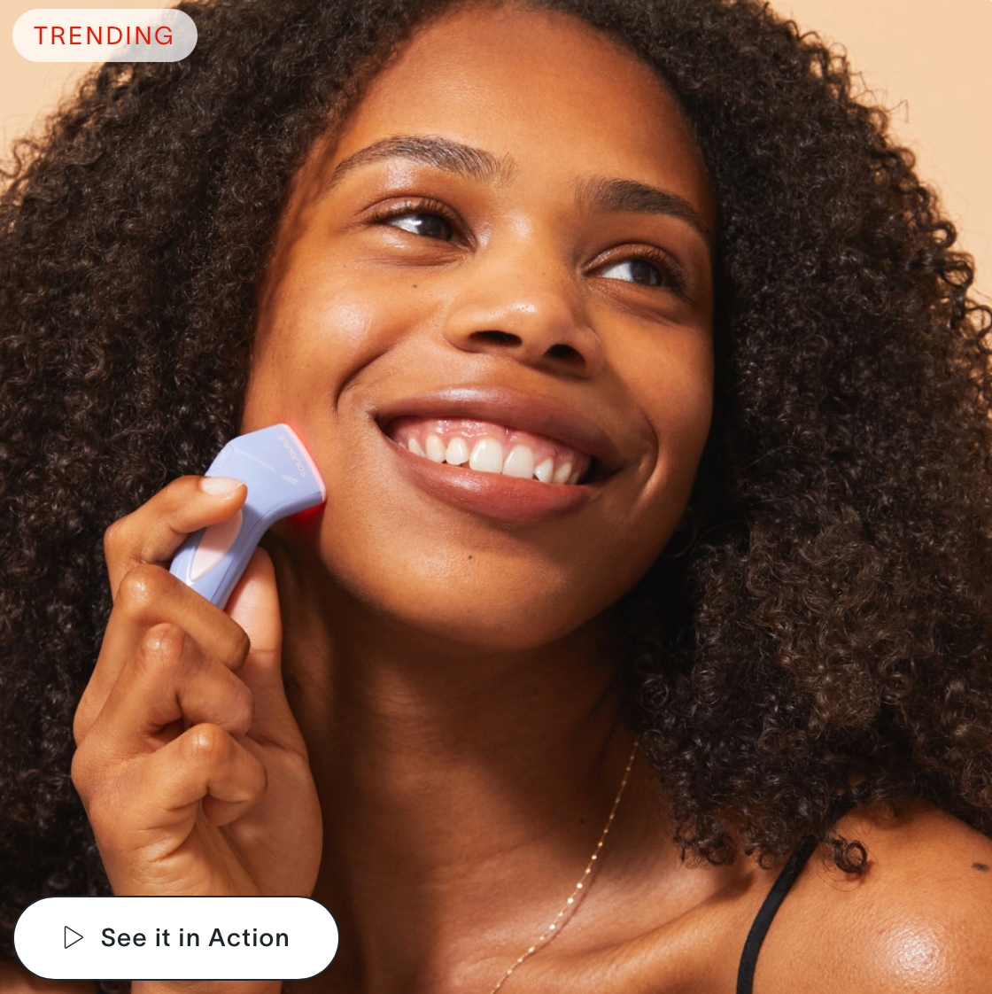
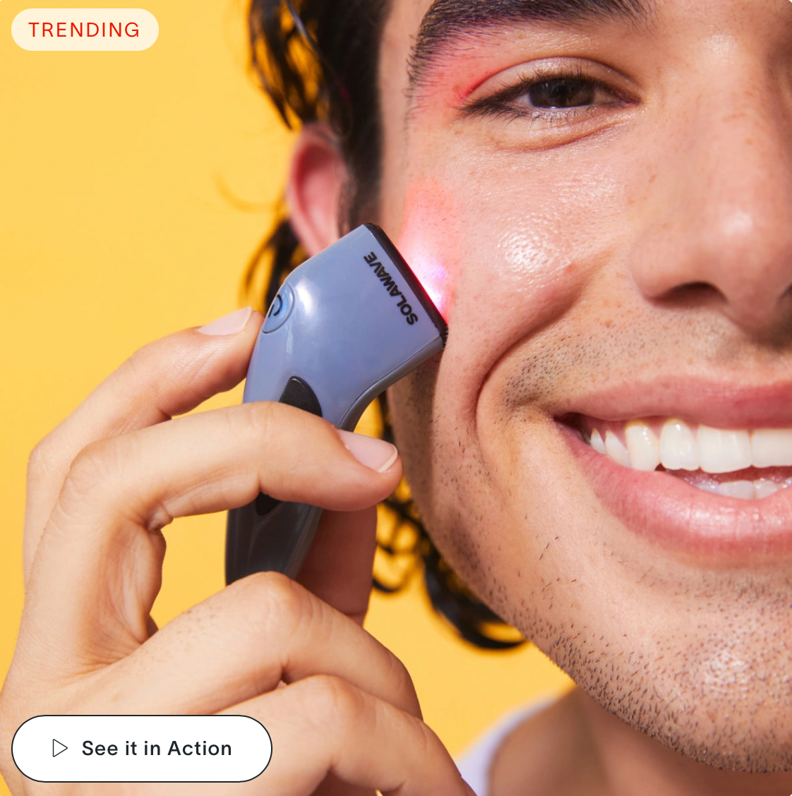


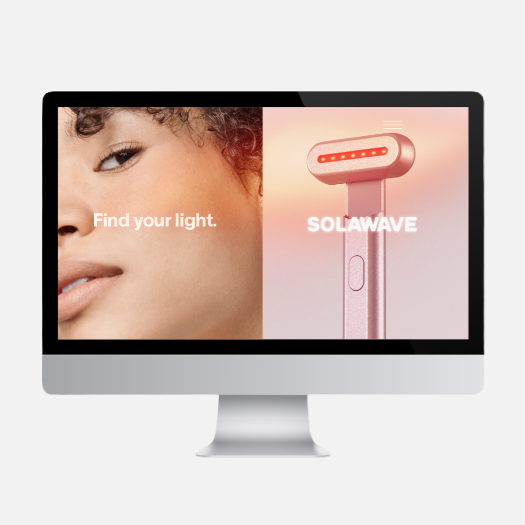

“Your mirror can’t handle this.” SOLAWAVE Ad Campaign: A bold message that suggests Solawave’s results are so transformative that even the user’s mirror will be “shocked.” This ad plays on vanity with an ironic edge, hinting at transformative results that challenge expectations.